For my final project, I made a blog for my course character Andrea which you can find here. While I have created subdomains before, this one made me use all of the skills I learned during this class.
First I came up with the concept of what she posts about, the pages she has, and the comments that would have to be under each one. I made a resume for her and rebuilt the business card I made for her earlier. It then took me forever to find a blog theme, font, color scheme, etc. that worked for Andrea’s personality I built over the semester. Sadly once I found things that worked there were of course many problems with how they looked that I had to fix. This is where what I learned this semester really was used.
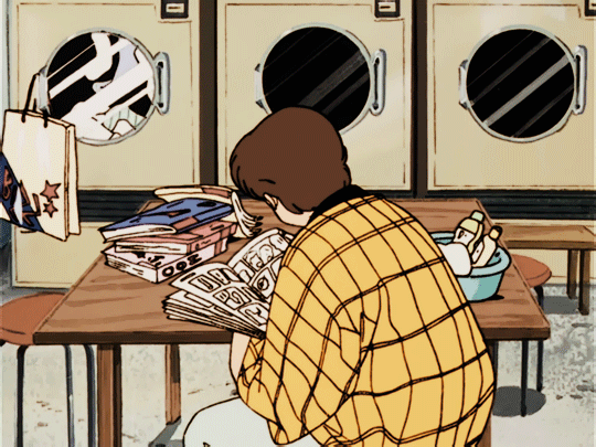
A lot of the time making this site went into the CSS coding on the backend. First I had to solve the problem of the post slider. Whenever you reloaded the site or just opened it for the first time there was a huge glitch where the photo size was normal but there was double the white space beneath it that wouldn’t go away until the next post came in. This disrupted the flow of the site and since Andrea is a software engineer I couldn’t just leave that error in. So after many hours over a few days of troubleshooting, I figured out how what element was causing the problem, how to override the original code (since I couldn’t find the line in the actual theme files which there are many), and then I added specific code to fix it based on the device you were on. The mobile device especially needed this slider fixed as the original theme cut off the image and the text was unreadable without this fix. Next, to really sell that this blog has been posting for a year I had to get rid of the comment post dates because, unlike post dates, those could not be changed. I then added a hover effect like I have on this blog to reduce the static look of the home page. Finally, I edited the size of the site’s title and description because they were way too small to read, and I added a bit more space between the top of the site and the title. The images below show how I did all of this and you can also see the difference between how it looks on different devices.
Obviously, it is not the smoothest fix as I am nowhere near becoming a computer programmer, but over the weeks of this course, these are all the skills I learned in CSS coding so that my site can look exactly how I want it to. After all I’ve done this semester, this project took the most time and frustrated me the most (especially the individual comments I had to do under different names) but in the end I really enjoyed the final product.